About this blog post
The idea for this post came to me just recently, when an anonymous reviewer of one of my manuscripts praised me for the “very high quality” of my visualizations. Since almost all of them were generated using the base graphics functions of R, I decided to turn the R script I wrote for these figures into a small series of posts. If you want to know where this is going, have a look at my original publication on visuo-spatial learning in mouse lemurs. To avoid copyright infringements (though I am the author of the article and the journal is open access), I will not use the original data for the tutorials, but generate artificial data, instead.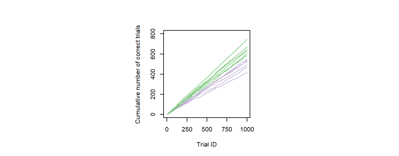
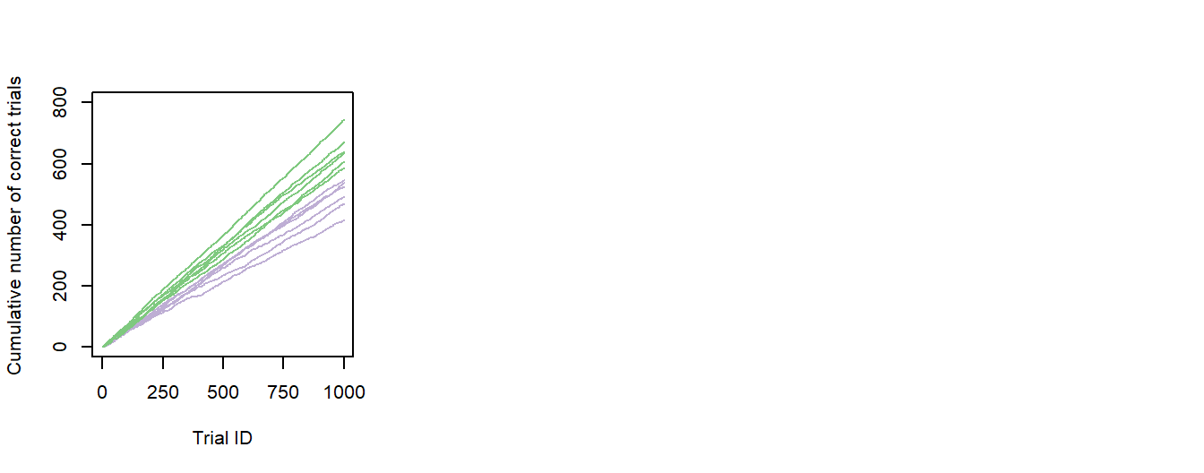
Figure 1: Individual performance data. The graph presents fictive cumulative sums of correct responses for six young (green) and six old (purple) individuals over the first 1000 trials of an experiment.
The first post of this series will start slowly, with a line graph, and it will also touch on some general topics, such as rendering to files and coloring. I will go through the code used to generate Fig. 1 of this post, i.e. a line graph showing the cumulative number of correct decisions some animals made over the course of a very long experiment. Different animals are presented in different colors, depending on their age (old vs. young; Fig. 1). At the end of this post, you will also find the script for a supporting figure that is highly similar to Fig. 1, but includes some additional information represented by arrows.
In summary, this post demonstrates how to:
- generate a simple series of integers
- generate random binary data with probability weights for 0 and 1
- draw a simple line plot and to add individual lines
- add color to a plot
- scale the axes of a plot
- remove the auto-generated axes of a plot and replace them by custom ticks and labels
- add arrows to a plot
- define dimensions and resolution of a render output
- render several plots as a single figure/file
Why should I use base graphics?
The decision whether to use ggplot or base graphics for visualizations in R is probably a matter of taste and I regularly use both approaches. I often use base graphics to get a very first impression of my data and change to ggplot, if necessary or advantageous. In many cases, however, I stick with my original graphs and simply improve their visual appearance. Especially when preparing figures for scientific articles, I prefer this approach, because base graphics start clean and simple (which is ideal for presenting scientific data) and can easily be “beautified”. Ggplot is often advantageous for immediate visualizations of complex or large data sets, but, personally, I do not like the defaults of ggplot. Often I find myself spending just as much or more time customizing ggplot graphs than it would have taken to build the same graphs from scratch using base graphics. Finally, for R base graphics there are very convenient methods to export/render them to a file that exactly matches the style guidelines for figures of different journals.
Preparing the data
First, we need some data. For our imaginary example, let us observe 12 individuals, six old and six young ones, completing 1000 trials of a given task. For data processing, I will generate a data frame with a trial identifier (trialID) as its fist column and the binary information success/fail for each trial and individual in 12 additional columns (one per animal):
# Generates a vector of Ids for the 1000 trials
trialId    <- 1:1000

# Generates a data frame with the Ids as its first column
data       <- data.frame(Trial_ID = trialId)

# Generates binary data for individual 1
data$Ind1  <- sample(0:1, 1000, replace=T,prob=c(0.45,0.55))

...

# Generates binary data for individual 12
data$Ind12 <- sample(0:1, 1000, replace=T,prob=c(0.25,0.75))
From this synthetic raw data, we can now calculate the individual values for the cumulative correct trials:
# Calculates the cumulative sum for individual 1
data$Ind1Cumul  <- cumsum(data$Ind1)

...

# Calculates the cumulative sum for individual 12
data$Ind12Cumul <- cumsum(data$Ind12)
I chose this formatting of the data (wide-format; one column per individual) as it gives me full control over every single line of the graph we are about to plot in a very intuitive way. There are, of course, more elegant ways to format data, but for now let us start coding with the data frame I just created.
Generating a black-and-white line plot
As a start, we will simply plot the data of all animals in the same color using the following lines of code:
# Plot data from individual 1
plot(data$Ind1Cumul ~ data$Trial_ID,    # Formula: Plots the number of correct decisions against the trial ID
  ylim = c(0,1000),                     # Set to 1000 as this is the theoretical maximum (100% correct)
  xlim = c(0,1000),                     # All 1000 trials are displayed
  col = "black",                        # Color of the line (black = default)
  type = "l",                           # "l" = line graph
  ylab = "Cumulative number of correct trials",  # Labeling of the y-axis
  xlab = "Trial ID")                             # Labeling of the x-axis

# Add individual 2
points(data$Ind2Cumul ~ data$Trial_ID,  # Formula
   col = "black",                       # Color of the line (black = default)
   type = "l")                          # Line graph

...                                     # Repeat for all individuals

# Add individual 12
points(data$Ind12Cumul ~ data$Trial_ID, # Formula
   col = "black",                       # Color of the line (black = default)
   type = "l")                          # Line graph
So here is the resulting graph, clean and simple:
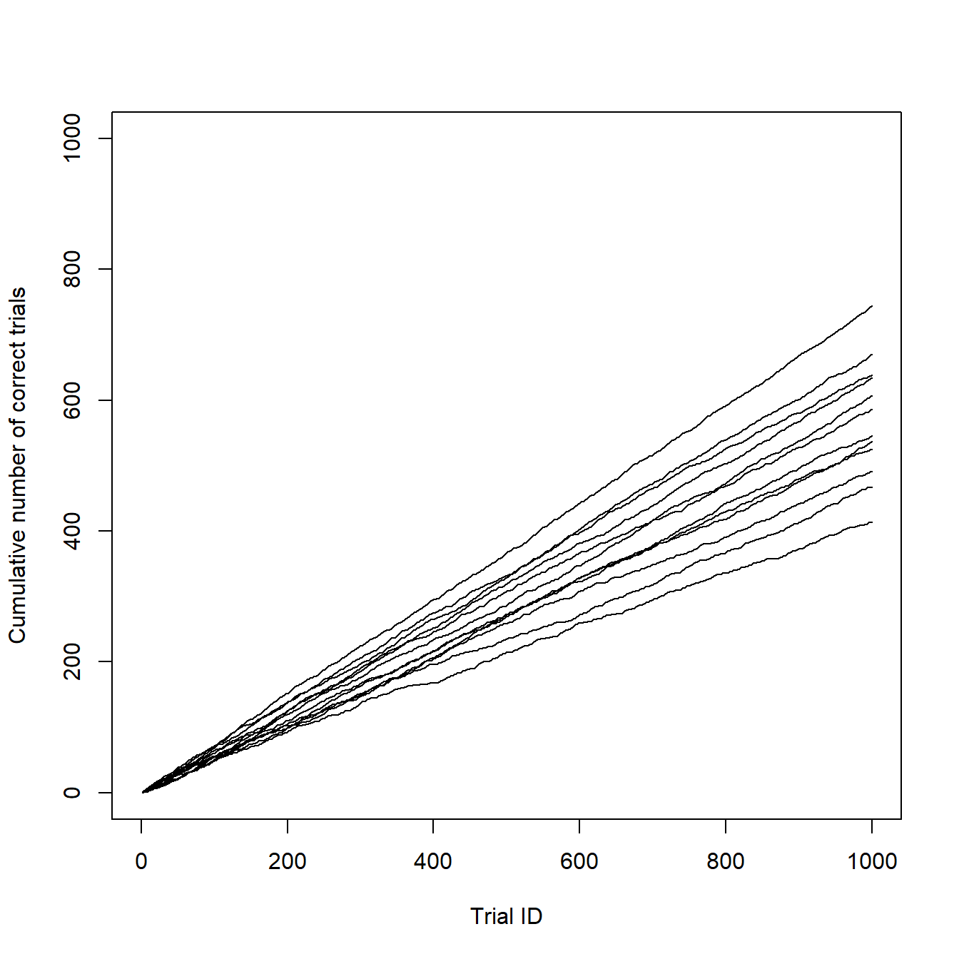
However, even I have to admit, that it is a little too clean and it lacks the information about the age of the individuals. Do you remember? There were six young and six old individuals in our sample. Let individuals 1-6 be the old ones and 7-12 the young ones. In my original article, I used different colors for each age group.
Choosing adequate colors and adding them to the graph
Before we add some colors to our graph, we will have to decide which colors to use. For my article, I used a unified color concept for all figures, so I had to think very carefully about which color to use and where. An online tool that helped me a lot in choosing colors is Color Brewer 2.0. It suggests color palettes for different types of data sets and provides the hex codes for each color of the selected palette. I decided for a greenish color (#7fc97f) for the young individuals and a purple color (#beaed4) for the old ones. I also changed the range of the y-axis to make better use of the space. Making these adjustments results in a much more appealing and informative graph:
# Plot data of individual 1
plot(data$Ind1Cumul ~ data$Trial_ID,
  ylim = c(0,800),                        # Limits the y-axis to a value slightly above the highest observed value
  xlim = c(0,1000),
  col = "#beaed4",                        # Color of the line (purple)
  type = "l",
  ylab = "Cumulative number of correct trials",
  xlab = "Trial ID")

# Add individual 2
points(data$Ind2Cumul ~ data$Trial_ID,
   col = "#beaed4",                       # Color of the line (purple)
   type = "l")

...

# Add individual 12
points(data$Ind12Cumul ~ data$Trial_ID,
   col = "#7fc97f",                       # Color of the line (green)
type = "l") 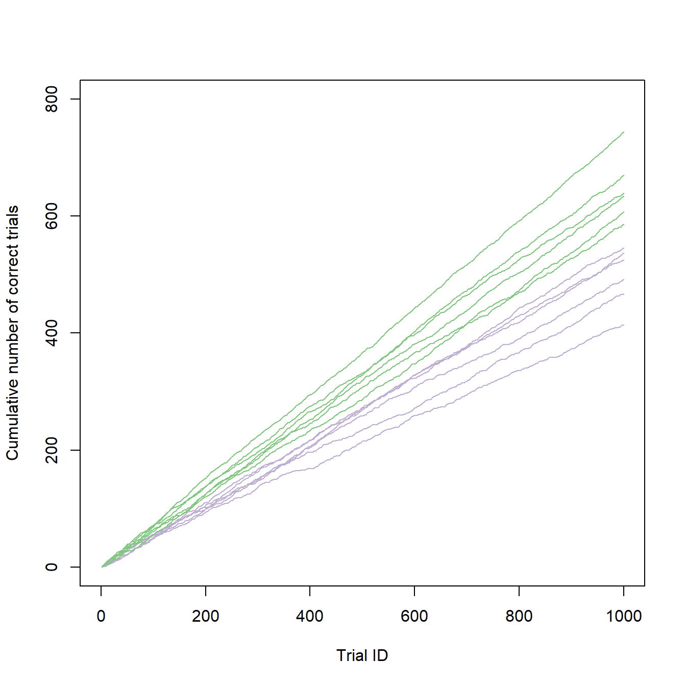
It looks like there is a clear separation of performances between the age groups, which we can now deduce from the colored graph. So let us prepare and render the plot for publication.
Rendering the plot in accordance with journal guidelines
For my paper, I needed this figure as one of six sub-figures and usually journals have very specific guidelines for the submission of electronic artwork. The journal I submitted my manuscript to allowed .png-files with a minimum resolution of 600 dpi for line art. Full page figures were supposed to have a total width of 178 mm.
Rendering R base graphics to exactly meet these requirements is very straight forward. First, we will have set the file parameters using the following code:
# Setting the output parameters
png("Figure 2a - Performance vs. Age.png",    # File name (saved in the working directory)
  width = 178,                                # Figure width in "units"
  height = 140,                               # Figure height in "units"
  units = "mm",                               # Sets unit to millimeter
  res = 600)                                  # Resolution in dots per inch (dpi)

  ...
Next, we will have to make sure that all our sub-figures are plotted into the same file/plotting space using the following line of code:
...

# Create a matrix of plots
par(mfrow = c(2,3))   # A plot matrix with two rows and three columns

...
Now we run the code for our different sub figures and finally render the file by closing the plot:
...

############################
# Code for sub-figures 1-6 #
############################

# Close the specified plot
dev.off()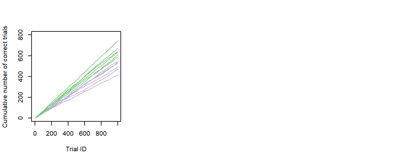
So far, we have only one sub-figure, so the resulting plot is quite empty. Also the x-axis looks awkward, due to the resizing (the 1000 does not fit). The latter can easily be fixed by customizing the x-axis of our plot:
# Plots the line graph without its original x-axis
plot(data$Ind1Cumul ~ data$Trial_ID,
  ylim = c(0,800),
  xlim = c(0,1000),
  col = "#beaed4",
  type = "l",
  ylab = "Cumulative number of correct trials",
  xlab = "Trial ID",
  xaxt = "n")                                   # Remove x-axis

# Generates a new x-axis
axis(side = 1,                                  # X-axis
  at = c(0, 250, 500, 750, 1000),               # Position of ticks
  labels = c("0","250","500","750","1000"))     # Tick labels

...
Adding longitudinal data
This part is just for the sake of completeness. In the supporting materials of my original manuscript I also presented data from three animals that were tested twice in the same task. During the first testing, all individuals were young. During the second testing, one individual was still young (as it was re-tested immediately after the first experiment) and the other two were several years older than during their first run. To add this information, I needed additional colors and some way to illustrate individual performance differences at the last trial between first and second experiment. In total, I made the following adjustments:
- Adding the individual data from the second runs in blue (#386cb0; for the individual tested twice at young age) and yellow (#fdc086; for the individuals tested at young and old age)
- changing the range of the x-axis (to gain some space for plotting)
- Adding arrows in the same colors as the new lines (to visualize the performance change between first [base] and second [tip] experiment)
These changes are easily implemented in our previous code:
# Plots the original line graph with extended x-axis
plot(data$Ind1Cumul ~ data$Trial_ID,
  ylim = c(0,800),
  xlim = c(0,1350),                       # Extending the x-axis
  col = "#beaed4",
  type = "l",
  ylab = "Cumulative number of correct trials",
  xlab = "Trial ID",
  xaxt = "n")

axis(side = 1,                            # X-axis
  at = c(0, 250, 500, 750, 1000),         # Position of ticks
  labels = c("0","","500","","1000"))     # Tick labels

...                                       # Original chunk of code

# Adding new data
points(data$Ind10Cumul_2 ~ data$Trial_ID,
   col = "#386cb0",                       # Color of the line (blue)
   type = "l")

points(data$Ind11Cumul_2 ~ data$Trial_ID,
   col = "#fdc086",                       # Color of the line (yellow)
   type = "l")

points(data$Ind12Cumul_2 ~ data$Trial_ID,
   col = "#fdc086",                       # Color of the line (yellow)
   type = "l")

# Adding the arrows
library(shape)                            # Library needed for drawing arrows

Arrows(1100, data$Ind10Cumul[1000],       # XY-coordinates for the arrow base
1100, data$Ind10Cumul_2[1000],            # XY-coordinates for the arrow tip
arr.type="triangle",                      # Arrow type
arr.width=0.1,                            # Arrow head width in cm
arr.length=0.15,                          # Arrow head length in cm
lwd = 1,                                  # Line width
arr.adj = 1,                              # Causes tip of the arrowhead to touch the point
col = "#386cb0")                          # Color of the line (blue)

Arrows(1200, data$Ind11Cumul[1000],       # XY-coordinates for the arrow base
1200, data$Ind11Cumul_2[1000],            # XY-coordinates for the arrow tip
arr.type="triangle",                      # Arrow type
arr.width=0.1,                            # Arrow head width in cm
arr.length=0.15,                          # Arrow head length in cm
lwd = 1,                                  # Line width
arr.adj = 1,                              # Causes tip of the arrowhead to touch the point
col = "#fdc086")                          # Color of the line (yellow)

Arrows(1300, data$Ind12Cumul[1000],       # XY-coordinates for the arrow base
1300, data$Ind12Cumul_2[1000],            # XY-coordinates for the arrow tip
arr.type="triangle",                      # Arrow type
arr.width=0.1,                            # Arrow head width in cm
arr.length=0.15,                          # Arrow head length in cm
lwd = 1,                                  # Line width
arr.adj = 1,                              # Causes tip of the arrowhead to touch the point
col = "#fdc086")                          # Color of the line (yellow)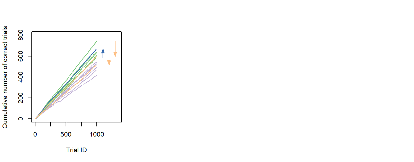
Outlook
In the next post of this series, I will explain how to summarize the data we just plotted into group learning curves and how to plot these curves with beautiful, bootstrapped confidence intervals.