About this blog post
The idea for this post came to me just recently, when an anonymous reviewer of one of my manuscripts praised me for the “very high quality” of my visualizations. Since almost all of them were generated using the base graphics functions of R, I decided to turn the R script I wrote for these figures into a small series of posts. If you want to know where this is going, have a look at my original publication on visuo-spatial learning in mouse lemurs. To avoid copyright infringements (though I am the author of the article and the journal is open access), I will continue working with the artificial data I generated in the previous post.
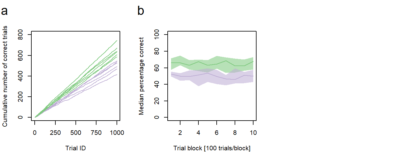
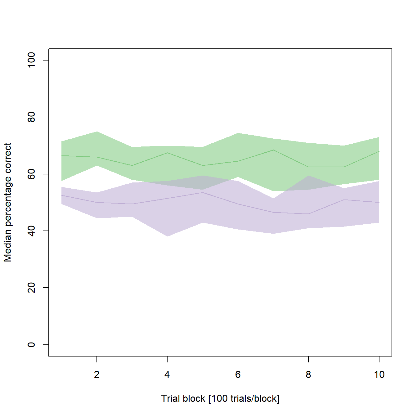
Figure 1: Performance vs. age. a Cumulative sums of correct responses for six young and six old individuals over the first 1000 trials of an experiment. b Median group learning curves with bootstrapped confidence intervals. a,b green: young animals; purple: old animals.
In the second post of this series, I will describe how to generate a new type of line graph with two group learning curves, representing the median performances of the young and the old individuals, and bootstrapped confidence intervals for each learning curve (Fig. 1b).
In summary, this post demonstrates how to:
- calculate the summary statistics (median learning curves) from the individual data
- bootstrap confidence intervals for a mean
- add confidence intervals to a line graph using polygons
- add sub-figure labels to a plot
Preparing the data
For simplicity, we will continue working with the data generated in the last post. To obtain individual learning curves, we divide the 1000 trials of each individual into blocks of 100 trials and calculate the percentage of correct decision for each block. As before, we store the results to a data frame, but this one has identifiers for each trial block as its first column:
# Generates a data frame with Ids for the 10 trial blocks
data2      <- data.frame(TrialBlock_ID = 1:10)

# Calculates the percentage correct for each trial block for individual 1
perCorrect <- c()
for (i in 1:10) {perCorrect <- c(perCorrect, sum(data$Ind1[(1+(100*(i-1))):(i*100)]))}
data2$Ind1  <- perCorrect

...

# Calculates the percentage correct for each trial block for individual 12
perCorrect <- c()
for (i in 1:10) {perCorrect <- c(perCorrect, sum(data$Ind12[(1+(100*(i-1))):(i*100)]))}
data2$Ind12  <- perCorrect
From this new data, we can now calculate the group median statistics. As before, individuals 1-6 are the old ones, individuals 7-12 are the young ones:
# Calculates the group median statistics
medianOld <- c()
for (j in 1:10) {
medianOld <- c(medianOld,
               median(c(data2$Ind1[j],
               data2$Ind2[j],
               data2$Ind3[j],
               data2$Ind4[j],
               data2$Ind5[j],
               data2$Ind6[j])))}
data2$MedianOld  <- medianOld

medianYoung <- c()
for (j in 1:10) {
medianYoung <- c(medianYoung,
                 median(c(data2$Ind7[j],
                 data2$Ind8[j],
                 data2$Ind9[j],
                 data2$Ind10[j],
                 data2$Ind11[j],
                 data2$Ind12[j])))}
data2$MedianYoung  <- medianYoung
Generating a colored line plot
Let us take a first look at our data:
# Plot median performance of the young individuals
plot(data2$MedianYoung ~ data2$TrialBlock_ID,
     ylim = c(0,100),                                 # As values cannot exceed 100%
     col = "#7fc97f",
     type = "l",
     xlab = "Trial block [100 trials/block]",
     ylab = "Median percentage correct")

# Add the median performance of old individuals
points(data2$MedianOld ~ data2$TrialBlock_ID,
       col = "#beaed4",
       type = "l")
It seems as if the young individuals constantly performed better than the old individuals (and that there is not much learning going on in both samples of our synthetic data). But how reliable are our median learning curves? To get a better impression, the next step is to bootstrap confidence intervals (CIs) for each median.
Bootstrapping confidence intervals for a median
In a first step, we will generate empty vectors for the CI limits:
upperYoung  <- c()
lowerYoung  <- c()
upperOld    <- c()
lowerOld    <- c()

...
Next, we will fill these vectors by bootstrapping the belonging values using the empirical method:
...

for (k in 1:10){
  xKold <- c(data2$Ind1[k],
             data2$Ind2[k],
             data2$Ind3[k],
             data2$Ind4[k],
             data2$Ind5[k],
             data2$Ind6[k])

  xKyoung <- c(data2$Ind7[k],
               data2$Ind8[k],
               data2$Ind9[k],
               data2$Ind10[k],
               data2$Ind11[k],
               data2$Ind12[k])

  # Compute the difference between each of 1000 bootstrapped medians and the belonging sample median for the young animals
  bstrapYoung  <- c()
  for (l in 1:1000){
    bstrapYoung <- c(bstrapYoung, (median(sample(xKyoung,6,replace=T))) - data2$MedianYoung[k])}

  # Compute the lower and upper limits of the 95% CIs
  lowerYoung <- c(lowerYoung, (data2$MedianYoung[k] + quantile(bstrapYoung,.025)))
  upperYoung <- c(upperYoung, (data2$MedianYoung[k] + quantile(bstrapYoung,.975)))

  # Compute the difference between each of 1000 bootstrapped medians and the belonging sample median for the old animals
  bstrapOld  <- c()
  for (m in 1:1000){
    bstrapOld <- c(bstrapOld, (median(sample(xKold,6,replace=T))) - data2$MedianOld[k])}

  # Compute the lower and upper limits of the 95% CIs
  lowerOld <- c(lowerOld, (data2$MedianOld[k] + quantile(bstrapOld,.025)))
  upperOld <- c(upperOld, (data2$MedianOld[k] + quantile(bstrapOld,.975)))
}

...
Finally, we can add the confidence intervals to our line graph using polygons:
...

plot(data2$MedianYoung ~ data2$TrialBlock_ID,
     ylim = c(0,100),
     type = "l",
     col = "#7fc97f",
     xlab = "Trial block [100 trials/block]",
     ylab = "Median percentage correct")

points(data2$MedianOld ~ data2$TrialBlock_ID,
       col = "#beaed4",
       type = "l")

# Add the CIs for the young animals
polygon(c(data2$TrialBlock, rev(data2$TrialBlock)),     # X-coordinates of the polygon vertices (clockwise)
c(lowerYoung, rev(upperYoung)),                         # Y-coordinates of the polygon vertices (clockwise)
        col = "#7fc97f90",                              # green with some transparency
        border = NA)                                    # no border

# Add the CIs for the old animals
polygon(c(data2$TrialBlock, rev(data2$TrialBlock)),
        c(lowerOld, rev(upperOld)),
        col = "#beaed490",                              # purple with some transparency
        border = NA)
From the confidence intervals it seems as if the better performance in the young animals is not as clear as previously assumed. In some cases, there is overlap in the CIs of both medians. If you would like to test, whether there are significant differences between the two medians of a given trial block, make sure to visit this post of mine to find an adequate method.
Rendering the plot together with sub-figure a
As stated in the previous post, we want our new plot to be one of a total of six plots in a larger figure. We can now combine the new plot with the previous one and render it to a single file. We should also add some sub-figure labels:
# Setting the output parameters
png("Figure 2a - Performance vs. Age.png",    # File name (saved in the working directory)
  width = 178,                                # Figure width in "units"
  height = 140,                               # Figure height in "units"
  units = "mm",                               # Sets unit to millimeter
  res = 600)                                  # Resolution in dots per inch (dpi)

# Create a matrix of plots
par(mfrow = c(2,3))   # A plot matrix with two rows and three columns

#########################
# Code for sub-figure 1 #
#########################

# Add an "a" to the left top of sub-figure 1
fig <- par("fig")                                               ###
x <- grconvertX(c(0, dev.size("in")[1]), from="in", to="user")    # Finds the x-coordinate of the left border of the sub-figure
x <- x[1] + (x[2] - x[1]) * fig[1:2]                            ###
x <- x[1] + strwidth("a", cex=2.6) / 2                            # Adds a few pixels to this coordinate
mtext("a", side = 3, at=x, line = 2, cex = 1.3)                   # Positions the letter "a" at the top left corner

#########################
# Code for sub-figure 2 #
#########################

# Add an "b" to the left top of sub-figure 2
fig <- par("fig")
x <- grconvertX(c(0, dev.size("in")[1]), from="in", to="user")
x <- x[1] + (x[2] - x[1]) * fig[1:2]
x <- x[1] + strwidth("b", cex=2.6) / 2
mtext("b", side = 3, at=x, line = 2, cex = 1.3)

# Close the specified plot
dev.off()
Outlook
In the next post of this series, we will add customized box plots to our figure.