About this blog post
The idea for this post came to me just recently, when an anonymous reviewer of one of my manuscripts praised me for the “very high quality” of my visualizations. Since almost all of them were generated using the base graphics functions of R, I decided to turn the R script I wrote for these figures into a small series of posts. If you want to know where this is going, have a look at my original publication on visuo-spatial learning in mouse lemurs. To avoid copyright infringements (though I am the author of the article and the journal is open access), I will continue working with the artificial data I generated in the two previous posts on line graphs (sub-figure a) and bootstrapped conficence intervals (sub-figure b) and I will generate some new, normally distributed data introducing the norm() function.
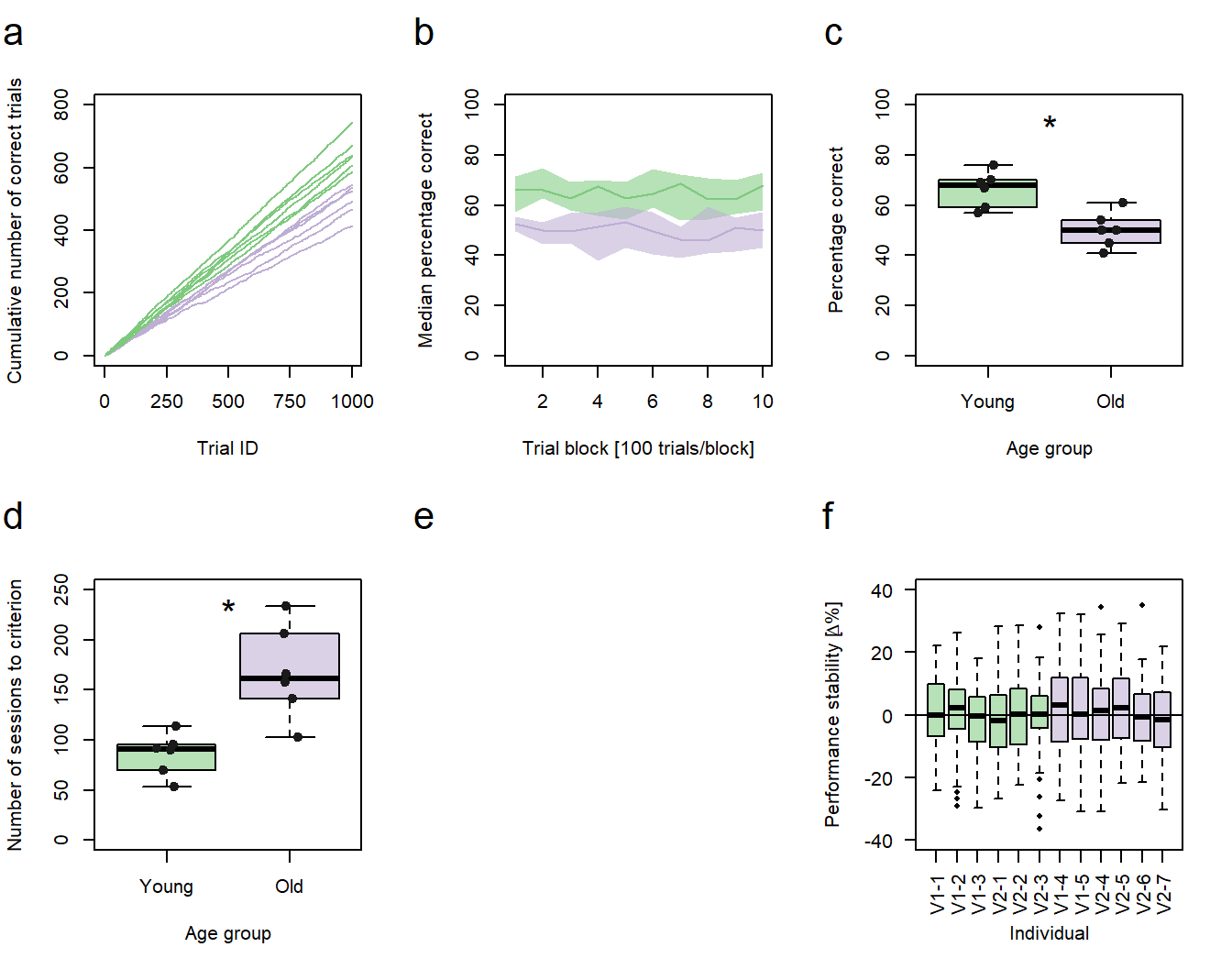
Figure 1: Performance vs. age. a-d, f Green: young animals; purple: old animals. a Cumulative sums of correct responses for six young and six old individuals over the first 1000 trials of an experiment. b Median group learning curves with bootstrapped confidence intervals. c Comparison of individual percentages correct at trial block 10 between the age groups. d Comparison of the individual number of sessions needed to reach a learning criterion between the age groups. c,d Significance code: *p<0.05. f Individual session-to-session performance stabilities calculated for the first 60 sessions. V1-1 - V1-5 = individuals trained in protocol variant 1; V2-1 - V2-7 = individuals trained in protocol variant 2.
In the third post of this series, I will describe how to generate box plots with individual data points being included and represented as “jittered” points (sub-figures c and d).
In summary, this post demonstrates how to:
- generate normally distributed data
- create a simple box plot
- add individual data points as jitter plots
- add text to the plot
- add greek letters to an axis label
- add group information to a box plot using different colors and custom labels
- determine the order in which the box plots are presented in a graph
- calculate an exact Wilcoxon test
Preparing the data
For the first sub-figure (c), there is only very little preparation necessary, as we already generated the data we are going to plot as box plots. It is the percentage of correct decisions each individual made in the last trial block (block 10). All we need to do is to format this data in a way that the boxplot() function of R can work with it. This time, we will use the long rather than the wide format for our data:
# Adds the last (10th) value of each individual from our previous table of individual percentages of correct decisions to a new vector
trialBlock10<- c(data2$Ind7[10],
                 data2$Ind8[10],
                 data2$Ind9[10],
                 data2$Ind10[10],
                 data2$Ind11[10],
                 data2$Ind12[10],
                 data2$Ind1[10],
                 data2$Ind2[10],
                 data2$Ind3[10],
                 data2$Ind4[10],
                 data2$Ind5[10],
                 data2$Ind6[10])

# Defines a second vector with group IDs (young vs. old)
groupID <- c(1,1,1,1,1,1,2,2,2,2,2,2)     # Young = 1; Old = 2
I usually use numbers as group IDs, as it allows me to intuitively specify the order in which the box plots of the different groups will later appear in the figure. You can also use text labels, but by default they will be ordered alphabetically. I will demonstrate later in this post how to customize the order of the box plots/factors, if necessarry.
Generating colored box plots
As before, we could now combine both vectors to a data frame for a table-like structure. Alternatively, we can use the vectors directly to define the formula for our visualization:
# Plots the data as a fungtion of the age group
boxplot(trialBlock10 ~ groupID,           # Formula
    ylab = "Percentage correct",          # Y-axis label
    xlab = "Age group",                   # X-axis label
    col = c("#7fc97f90","#beaed490"),     # Color vector with the colors for each group
    ylim = c(0,100),                      # 100% is the theoretical maximum
    names=c("Young","Old"))               # Adds text labels for the groups

...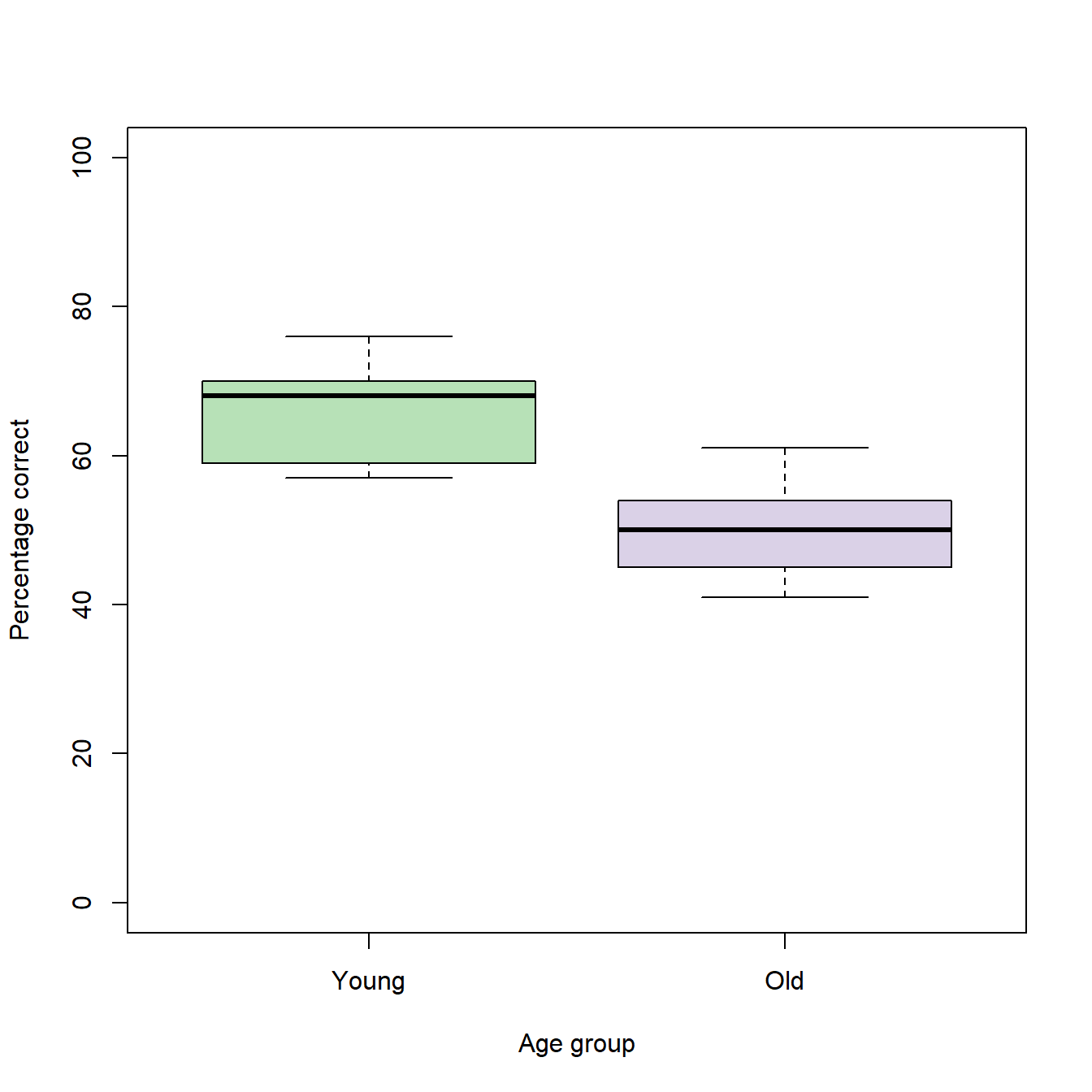
The interpretation of a box plot is quite simple. The bold, horizontal line within each box represents the group median. The box itself encloses the middle 50% of the data an extends from the 25th (lower edge) to the 75th (upper edge) percentile (= interquartile range; IQR). The whiskers extend to the most extreme values that are no more than 1.5 IQRs away from the edges of the box. Data points that do not fall into this range are depicted as outliers. Since our data do not contain outliers, the whiskers extend to the minimum and maximum values of each group.
To get a better idea of how the box plots represent the underlying data, we can add the individual data points as jitter plots using the stripchart() function:
...

stripchart(trialBlock10 ~ groupID,        # The same formula as for the box plots
vertical=TRUE,                            # The plots are drawn vertically (default is horizontally)
add=TRUE,                                 # Adds the chart to an existing plot
method="jitter",                          # Applies jittering to the plot
col = c("grey10","grey10"),               # Color vector with the colors for each group
pch=19,                                   # Specifies the symbol type for the data points
cex =1)                                   # Specifies the size of the symbols (1 = default)
For session block 10 it seems, as if the young individuals performed better than the old individuals. Under the assumptions that the population distributions represented by our samples of old and young individuals are independent and equal in shape and scale (which probably is not true), we can quickly test the hypothesis that the median of the young individuals differs significantly from the median of the old individuals using Wilcoxon statistics.
Conducting an exact Wilcoxon test
Usually, Wilcoxon statistics can easily be calculated in R using the function wilcox.test() and a single line of code:
# Calculates a Wilcoxon Test
wilcox.test(trialBlock10 ~ groupID)
## Warning in wilcox.test.default(x = c(70L, 67L, 59L, 57L, 69L, 76L), y = c(61L, :
## cannot compute exact p-value with ties
##
## Wilcoxon rank sum test with continuity correction
##
## data: trialBlock10 by groupID
## W = 34, p-value = 0.01291
## alternative hypothesis: true location shift is not equal to 0However, in our case the function returns an error message, because we have ties (two or more data points with the same value) in our data. This can also be seen in our jitter plots. In the group of the old individuals, two individuals exactly match the sample median. To adjust for these ties, we need the wilcox.exact() function from the “exactRankTests” package:
library("exactRankTests")
# Calculates an exact Wilcoxon Test
wilcox.exact(trialBlock10 ~ groupID)
## Package 'exactRankTests' is no longer under development.
## Please consider using package 'coin' instead.
##
## Exact Wilcoxon rank sum test
##
## data: trialBlock10 by groupID
## W = 34, p-value = 0.008658
## alternative hypothesis: true mu is not equal to 0If our assumptions about the population distributions are met, the low p-value returned by the exact Wilcoxon test suggests that there is a significant difference in the median performances at session block 10 between the age groups. For an alternative method that tests for such differences but has fewer assumptions to be met, have a look at my blog post on comparing two medians for differences. For now, we can live with the results from the exact Wilcoxon test and will continue with our box plots.
Adding text to a plot
In scientific publications, you will often find that the p-values returned by statistic tests are directly included in the figures in form of a simple code. In this code, one “asterisk” ("*") usually represents p-values between 0.05 and 0.01, two asterisks represent p-values between 0.01 and 0.001, and three asterisks represent p-values lower than 0.001. To add this code to our box plots, we can use the text function in R:
boxplot(trialBlock10 ~ groupID,
        ylab = "Percentage correct",
        xlab = "Age group",
        col = c("#7fc97f90","#beaed490"),
        ylim = c(0,100),
        names=c("Young","Old"))

stripchart(trialBlock10 ~ groupID,
vertical=TRUE,
add=TRUE,
method="jitter",
col = c("grey10","grey10"),
pch=19)

text(x = 1.5,   # X-coordinate of the text
     y = 100,   # Y-coordinate of the text
     "*",       # Text to be plotted
     pos = 1,   # Position of the text = below the coordinates
     cex = 2)   # "Size" of the text (character expansion factor)
Preparing the data for the other box plots (sub-figures d and f)
In my original publication, sub-figure d compares the number of sessions six young and six old mouse lemurs needed to reach a pre-defined learning criterion between the age groups. Sub-figure f compares the individual session-to-session performance stabilities of each individual - calculated for the first 60 sessions of my experiment - using 12 box plots (one for each individual). Just like in the previous sub-figures (a-c), the age group to which the animals belonged is color coded. As I used two variants of the same training method in my original study, sub-figure f also provides information about the training procedure in the tick-labels of the x-axis.
A “quick and dirty” solution for the generation of data for both sub-figures is to use the rnorm() function to simulate normally distributed samples:
### Sessions to criterion (data for sub-figure d)

# Generates a vector of six random numbers whose distribution is normal:
    sessionsYoung <- rnorm(6,    # sample size (6 young individuals)
                      65,    # mean
                      27)    # standard deviation

# Generates a vector of six random numbers whose distribution is normal:                sessionsOld   <- rnorm(6,    # sample size (6 old individuals)
                      155,   # mean
                      50)    # standard deviation

# Combines the two vectors
sessionsToCrit <- c(sessionsYoung, sessionsOld)

# Generates a vector with group Ids
groupID <- c(1,1,1,1,1,1,2,2,2,2,2,2)


### Performance stability (data for sub-figure f)

# Repeats the rnorm() function twelve times in a row to generate 59 values for each individual
performanceStability <- c(x <- rnorm(59, 0, 12),    # subject01
                          rnorm(59, 0, 12),         # subject02
                          rnorm(59, 0, 12),         # subject03
                          rnorm(59, 0, 12),         # subject04
                          rnorm(59, 0, 12),         # subject05
                          rnorm(59, 0, 12),         # subject06
                          rnorm(59, 0, 12),         # subject07
                          rnorm(59, 0, 12),         # subject08
                          rnorm(59, 0, 12),         # subject09
                          rnorm(59, 0, 12),         # subject10
                          rnorm(59, 0, 12),         # subject11
                          rnorm(59, 0, 12))         # subject12

# Generates a vector with subject identifiers (59 per subject; will later be used as tick labels)
stabilityGroup <- rep(c("V1-1", "V1-2", "V1-3", "V2-1", "V2-2", "V2-3", "V1-4", "V1-5", "V2-4", "V2-5", "V2-6", "V2-7"), each=59)

# Encodes the vector of subject identifiers as a factor and defines an order
stabilityGroup <- factor(stabilityGroup , levels=c("V1-1", "V1-2", "V1-3", "V2-1", "V2-2", "V2-3", "V1-4", "V1-5", "V2-4", "V2-5", "V2-6", "V2-7"))
Generating sub-figure d
We can now use the data generated above do plot sub-figure d. The code is the same as for sub-figure c, so you should already know how to do it:
# Generates the box plots
boxplot(sessionsToCrit ~ groupID,                     # Formula
        ylab = "Number of sessions to criterion",     # Label of the y-axis
        xlab = "Age group",                           # Label of the x-axis
        col = c("#7fc97f90","#beaed490"),             # Color for each box plot
        ylim = c(0,250),                              # Limits of the y-axis
        names=c("Young","Old"))                       # Tick label for each boxplot

# Adds an asterisk as text
text(x=1.5, y=250, "*", pos=1, cex=2)

# Adds individual data points as jitter plots
stripchart(sessionsToCrit ~ groupID, vertical=TRUE, add=TRUE, method="jitter", col =     c("grey10","grey10"), pch=19, cex =1)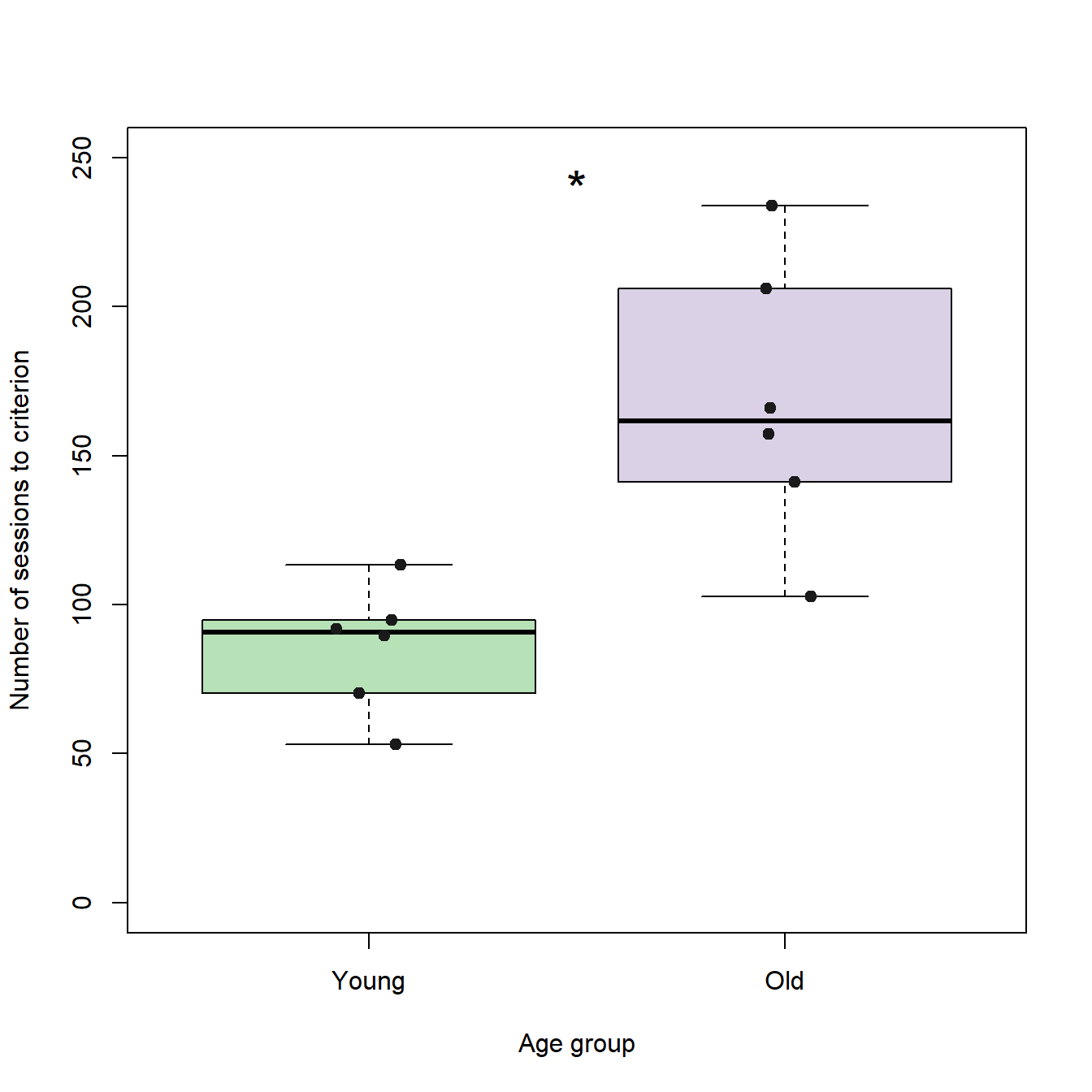
Generating sub-figure f
The code used for sub-figure f differs slightly from the previous code, as this sub-figure is slightly more complex: It uses text labels for the x-axis in a non-alphabetical order and the label of the y-axis includes a greek letter.
# Generates the box plots
boxplot(stabilityEarly ~ stabilityGroup,                     # Formula
        ylim = c(-40,40),                                    # Limits of the y-axis
        ylab = expression(paste("Performance stability [",   # To add a special character such as "Delta" to an axis-label, you can use the paste() function to
                                 Delta,                      # combine R objects and convert them to character vectors. The expression() function returns a vector of
                                 "%]")),                     # the type "expression". This vector can be passed to the y-axis label
        xlab = "Individual",                                 # Main label of the x-axis
        col = c("#7fc97f90","#7fc97f90","#7fc97f90",         # Vector with...
                "#7fc97f90","#7fc97f90","#7fc97f90",         # colors for...
                "#beaed490","#beaed490","#beaed490",         # each box...
                "#beaed490","#beaed490","#beaed490"),        # plot
        las=2,                                               # Orientation of the tick labels
        outpch = 16)                                         # Symbol used for outliers

# Adds a horizontal line at y = 0
abline(h=0)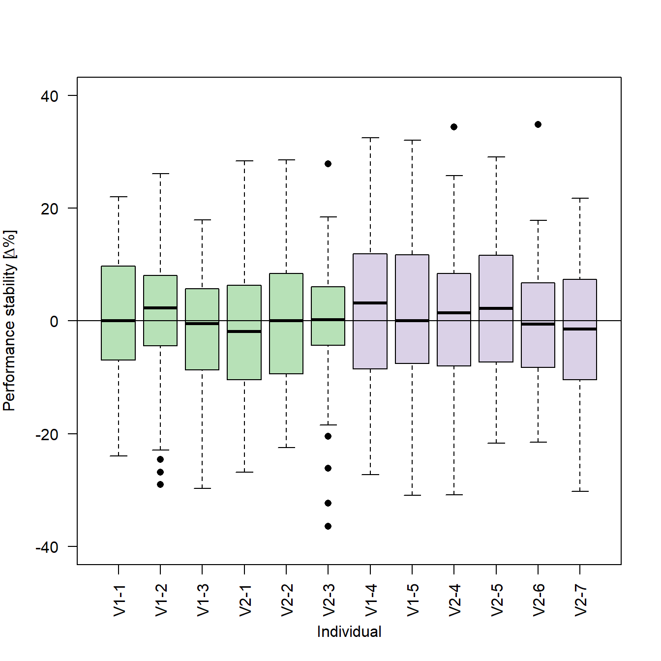
Please note that the tick labels for the x-axis are the subject identifiers we generated together with the data:
# Generates a vector with subject identifiers (59 per subject; will later be used as tick labels)
stabilityGroup <- rep(c("V1-1", "V1-2", "V1-3", "V2-1", "V2-2", "V2-3", "V1-4", "V1-5", "V2-4", "V2-5", "V2-6", "V2-7"), each=59)
The order of the individual box plots is the one we defined using the factor() function:
# Encodes the vector of subject identifiers as a factor and defines an order
stabilityGroup <- factor(stabilityGroup , levels=c("V1-1", "V1-2", "V1-3", "V2-1", "V2-2", "V2-3", "V1-4", "V1-5", "V2-4", "V2-5", "V2-6", "V2-7"))
By changing the order of the levels in the factor() function, we can also change the order of the individual box plots in our figure:
# Encodes the vector of subject identifiers as a factor and defines an order
stabilityGroup <- factor(stabilityGroup , levels=c("V1-1", "V1-2", "V1-3", "V1-4", "V1-5", "V2-1", "V2-2", "V2-3", "V2-4", "V2-5", "V2-6", "V2-7"))

# Generates the box plots
boxplot(stabilityEarly ~ stabilityGroup,                     # Formula
        ylim = c(-40,40),                                    # Limits of the y-axis
        ylab = expression(paste("Performance stability [",   # To add a special character such as "Delta" to an axis-label, you can use the paste() function to
                                 Delta,                      # combine R objects and convert them to character vectors. The expression() function returns a vector of
                                 "%]")),                     # the type "expression". This vector can be passed to the y-axis label
        xlab = "Individual",                                 # Label of the x-axis
        col = c("#7fc97f90","#7fc97f90","#7fc97f90",         # Vector with...
                "#beaed490","#beaed490","#7fc97f90",         # colors for...
                "#7fc97f90","#7fc97f90","#beaed490",         # each box...
                "#beaed490","#beaed490","#beaed490"),        # plot
        las=2,                                               # Orientation of the tick labels
        outpch = 16)                                         # Symbol used for outliers

# Adds a horizontal line at y = 0
abline(h=0)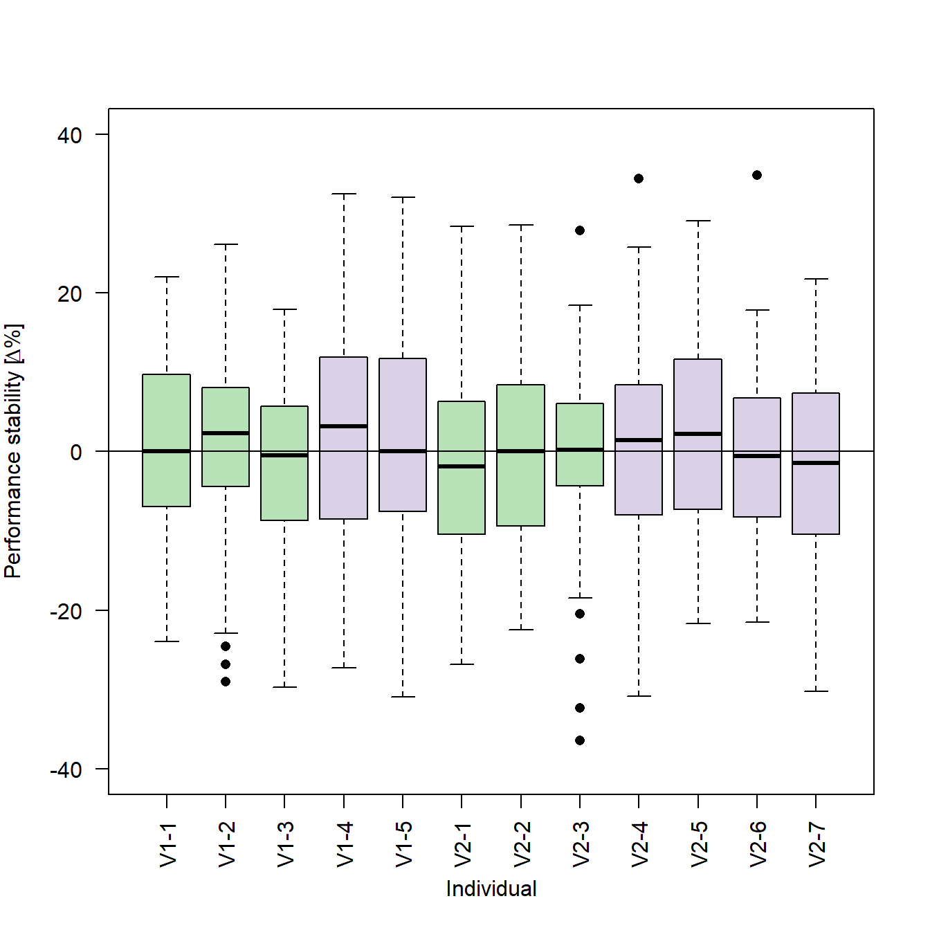
Rendering the plot together with the previous sub-figures
As stated in the previous posts, we want our new plots to be part of a larger figure. We can now combine the new plots with the previous plots and render it to a single file:
# Setting the output parameters
png("Figure 2 - Performance vs. Age.png",     # File name (saved in the working directory)
  width = 178,                                # Figure width in "units"
  height = 140,                               # Figure height in "units"
  units = "mm",                               # Sets unit to millimeter
  res = 600)                                  # Resolution in dots per inch (dpi)

# Create a matrix of plots
par(mfrow = c(2,3))   # A plot matrix with two rows and three columns

#########################
# Code for sub-figure a #
#########################

#########################
# Code for sub-figure b #
#########################

#########################
# Code for sub-figure c #

boxplot(trialBlock10 ~ groupID,
        ylab = "Percentage correct",
        xlab = "Age group",
        col = c("#7fc97f90","#beaed490"),
        ylim = c(0,100),
        names=c("Young","Old"))

stripchart(trialBlock10 ~ groupID,
           vertical=TRUE,
           add=TRUE,
           method="jitter",
           col = c("grey10","grey10"),
           pch=19)

text(x=1.5, y=100, "*", pos=1, cex=2)

#########################

#########################
# Code for sub-figure d #

boxplot(sessionsToCrit ~ groupID,
        ylab = "Number of sessions to criterion",
        xlab = "Age group",
        col = c("#7fc97f90","#beaed490"),
        ylim = c(0,250),
        names=c("Young","Old"))

stripchart(sessionsToCrit ~ groupID,
           vertical=TRUE,
           add=TRUE,
           method="jitter",
           col = ("grey10","grey10"),
           pch=19,
           cex =1)

text(x=1.5, y=250, "*", pos=1, cex=2)

#########################

#########################
# Code for sub-figure e #

frame()                                       # Generates an emtpy frame

fig <- par("fig")
x <- grconvertX(c(0, dev.size("in")[1]), from="in", to="user")
x <- x[1] + (x[2] - x[1]) * fig[1:2]
txt <- "e"
x <- x[1] + strwidth(txt, cex=2.6) / 2
mtext("d", side = 3, at=x, line = 2, cex = 1.3)

#########################

#########################
# Code for sub-figure f #

boxplot(stabilityEarly ~ stabilityGroup,
        ylim = c(-40,40),
        ylab = expression(paste("Performance stability [", Delta, "%]")),
        xlab = "Individual",
        col = c("#7fc97f90","#7fc97f90","#7fc97f90",
                "#7fc97f90","#7fc97f90","#7fc97f90",
                "#beaed490","#beaed490","#beaed490",
                "#beaed490","#beaed490","#beaed490"),
        las=2,
        outpch = 16)

abline(h=0)

#########################

# Close the specified plot
dev.off()
Outlook
In the next post of this series, we will create an XY-plot from individual data points and fit a regression line to the data to add the missing sub-figure (e).