About this blog post
The idea for this post came to me just recently, when an anonymous reviewer of one of my manuscripts praised me for the “very high quality” of my visualizations. Since almost all of them were generated using the base graphics functions of R, I decided to turn the R script I wrote for these figures into a small series of posts. If you want to know where this is going, have a look at my original publication on visuo-spatial learning in mouse lemurs. To avoid copyright infringements (though I am the author of the article and the journal is open access), I will not use the original data, but make up the data for the next plot (sub-figure e).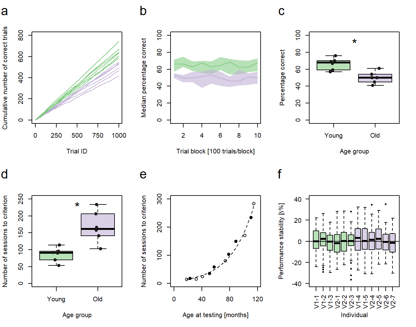
Figure 1: Performance vs. age. a-d, f Green: young animals; purple: old animals. a Cumulative sums of correct responses for six young and six old individuals over the first 1000 trials of an experiment. b Median group learning curves with bootstrapped confidence intervals. c Comparison of individual percentages correct at trial block 10 between the age groups. d Comparison of the individual number of sessions needed to reach a learning criterion between the age groups. c,d Significance code: *p<0.05. e Number of sessions to criterion as a function of age in months. Filled circles represent individuals trained in a protocol variant 1 (V1-1 - V1-5), hollow circles represent individuals trained in protocol variant 2 (V2-1 - V2-7). f Individual session-to-session performance stabilities calculated for the first 60 sessions.
In the fourth post of this series, I will describe how to generate XY-plots with individual data points being represented as points in a Cartesian coordinate system (Fig. 1e). Previous posts of the series discussed the code for the generation of line graphs (sub-figure a), bootstrapped conficence intervals (sub-figure b), and box plots (sub-figures c, d, and f).
In summary, this post demonstrates how to:
- create and polish an XY-plot
- calculate a simple linear regression model
- calculate a regression line and add it to the plot
- calculate confidence intervals for the regression line and add them to the plot
- calculate a poisson regression model
- subdivide a data frame
- add group information to a plot using different symbols
Preparing the data
As stated above, I will simply make the data for this graph up. In my original publication, the subfigure plotted the number of training sessions twelve mouse lemurs needed to reach a pre-defined learning criterion in a complex conditioning task against the individuals’ age at the time of testing. As two variants of the same method were used for conditioning, the training procedure of each animal was additionally represented using hollow and filled circles as symbols. This means, we need three values per individual to generate a similar subfigure, one for the performance, one for the age, and one for the method:
dataBothMethods <- data.frame(subjectID      <- c(1,2,3,4,5,6,7,8,9,10,11,12),                            # Subject identifiers
                              sessionsToCrit <- c(15, 18, 16, 25, 35, 59, 80, 103, 150, 170, 234, 283),   # Individual performance data
                              ageAtTest      <- c(18, 23, 32, 41, 51, 58, 74, 79, 89, 102,  111,  115),   # Individual age data
                              methodID       <- c(1,2,1,1,2,2,1,2,2,1,2,1))                               # Method identifiers
Generating a black-and-white XY-plot
We can easily plot the individual performance data as a function of individual age using the most basic plot function in R:
plot(dataBothMethods$sessionsToCrit ~ dataBothMethods$ageAtTest)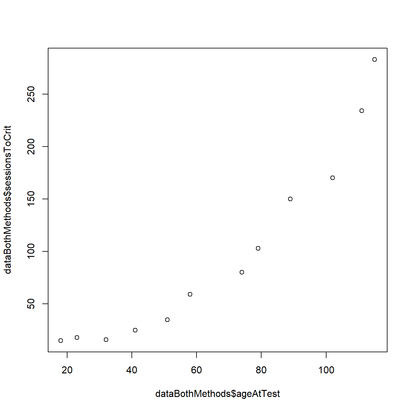
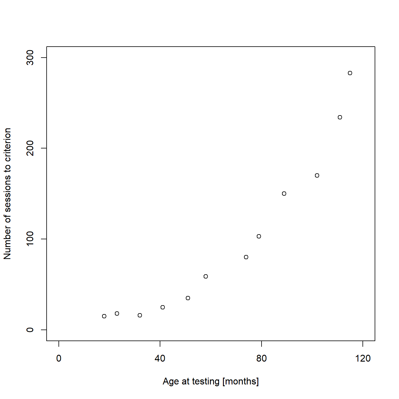
As the default scaling and labeling of the axes in our example is quite ugly, we will make some basic modifications to the plot to polish it. If you read the previous posts of this mini-series, you should already know how to add custom axes limits, tick marks, and labels:
plot(dataBothMethods$sessionsToCrit ~ dataBothMethods$ageAtTest,
    ylim = c(0,300),                                      # Limits of the Y-axis
    xlim = c(0,120),                                      # Limits of the X-axis
    ylab = "Number of sessions to criterion",             # Text label of the Y-axis
    xlab = "Age at testing [months]",                     # Text label of the X-axis
    yaxt = "n",                                           # Removes original  Y-axis
    xaxt = "n")                                           # Removes original  X-axis

    axis(side = 2,                                        # Custom Y-axis
    at = c(0, 100, 200, 300),                             # Position of ticks
    labels = c("0","100","200","300"))                    # Tick labels

    axis(side = 1,                                        # Custom X-axis
    at = c(0, 40, 80, 120),                               # Position of ticks
    labels = c("0","40","80", "120"))                     # Tick labels

    ...
Estimating a linear regression model
The polished plot looks much better, but I promised to also demonstrate how to add a regression line with confidence intervals to the plot. If we had used ggplot, this could have been done with a single command (g + geom_smooth(method=lm, se=TRUE)). Using R base graphics, more coding is necessary, but we also learn more about our data in the process. For a start, we will have to model our performance data as a linear function of age using the lm() function:
# Defines the linear model: lm(x~y)
model1 <- lm(dataBothMethods$sessionsToCrit ~ dataBothMethods$ageAtTest)

# Summary of the model
summary(model1)
The summarized output of the model looks like this:
##
## Call:
## lm(formula = dataBothMethods$sessionsToCrit ~ dataBothMethods$ageAtTest)
##
## Residuals:
##     Min      1Q  Median      3Q     Max
## -39.053 -21.432  -8.756  22.951  60.093
##
## Coefficients:
##                           Estimate Std. Error t value Pr(>|t|)
## (Intercept)                -68.391     20.918  -3.269  0.00844 **
## dataBothMethods$ageAtTest    2.533      0.284   8.920 4.48e-06 ***
## ---
## Signif. codes:  0 '***' 0.001 '**' 0.01 '*' 0.05 '.' 0.1 ' ' 1
##
## Residual standard error: 32.01 on 10 degrees of freedom
## Multiple R-squared:  0.8883, Adjusted R-squared:  0.8772
## F-statistic: 79.56 on 1 and 10 DF,  p-value: 4.485e-06
The p-values in the summary tell us that it is very likely that the intercept of our regression line differs from zero and even more likely that there is a positive, linear relationship between performance and age. The model estimates that the regression line crosses the Y-axis at -68.093 sessions (we will come back to this later) and that the number of sessions needed to reach the learning criterion increases an estimated 2.5 sessions with every increase of an individual’s age by one month. We can directly use these estimates to add a regression line to our plot:
...

abline(model1)

...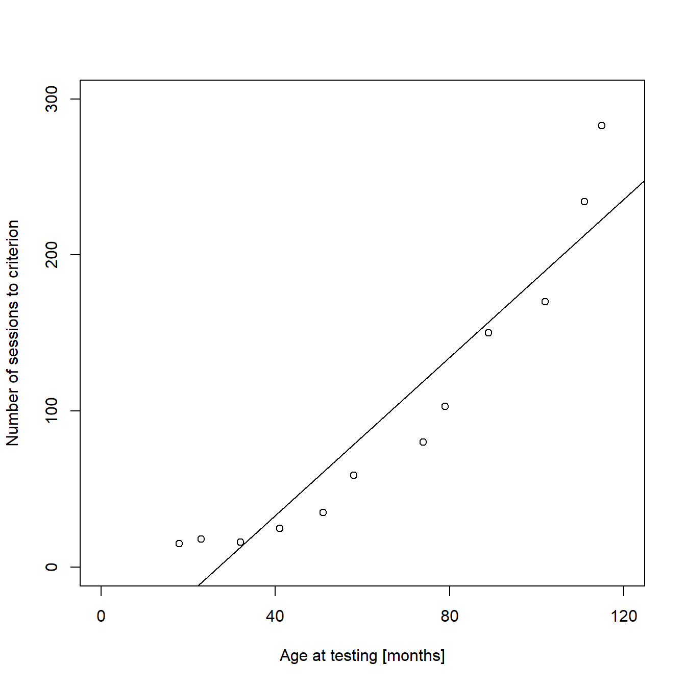
We can see from the graph that a linear function is not a good way to describe our data, as the fitted values for both low and high values of X are too small, while they are too high for all the intermediate values of X. In addition, the regression line crosses the X-axis, meaning that the model predicts negative values for “sessions to criterion” for very young individuals. This is obviously impossible. It is more likely that the expectation of Y depends on an exponential function of X. We will deal with this later, using a Poisson regression model. But before that, I will briefly explain how to calculate confidence intervals for our linear regression line and how to add them to the plot for cases where linear modeling is appropriate.
Adding confidence intervals to a regression line
To calculate confidence intervals for our regression line, we will use the predict() function of R. When using this function, the naming of your variables (vectors, column headings, etc.) is crucial and debugging can be a nightmare if names are too complex, like the ones we used above. Therefore, we will simplify our variable names before we calculate the confidence intervals:
...

# Defines two vectors (x and y) with the original data
x <- dataBothMethods$ageAtTest              # Age in months (x-values)
y <- dataBothMethods$sessionsToCrit         # Sessions to Criterion (y-values)

...
Next, we will create a new data frame with a column of new x-values for which we will estimate the belonging y-values of the regression line and the 95% confidence interval:
...

# Generates a sequence of values from the lowest to the highest original x-value
xNew <- seq(min(x),                         # from lowest original x-value
            max(x),                         # to highest original x-value
            by = 1)                         # increment = 1

# Generates a new data frame with the new sequence of x-values as column "x"
new <- data.frame(x = xNew)                 # Column name has to be the same as the name of the "Age in months" vector

# Predicts the belonging y-values (regression line, upper and lower 95% confidence interval)
preds <- predict(lm(y ~ x),                 # Model formula, identical to model1 from above
                 new,                       # Predictions are made for each x-value from the data frame "new"
                 interval = "confidence",   # Estimate confidence intervals
                 level = 0.95)              # Confidence level = 95%

# Adds the predictions to the data frame "new"
new <- cbind(new, preds)
The first rows of the resulting data frame should looks like this, with “x” being the age in months, “fit” being the belonging y-values of the regression line, and “lwr” and “upr” being the belonging y-values of the lower and upper limits of the 95% confidence interval:
##    x       fit       lwr      upr
## 1 18 -22.79652 -59.53340 13.94036
## 2 19 -20.26349 -56.47809 15.95111
## 3 20 -17.73046 -53.42635 17.96543
## 4 21 -15.19743 -50.37834 19.98348
## 5 22 -12.66440 -47.33423 22.00543
## 6 23 -10.13137 -44.29420 24.03145
We can now use these estimates as input for the plotting of the regression line and its confidence intervals:
# Original plot without regression line
plot(dataBothMethods$sessionsToCrit ~ dataBothMethods$ageAtTest,
   ylim = c(0,300),                                      # Limits of the Y-axis
   xlim = c(0,120),                                      # Limits of the X-axis
   ylab = "Number of sessions to criterion",             # Text label of the Y-axis
   xlab = "Age at testing [months]",                     # Text label of the X-axis
   yaxt = "n",                                           # Removes original  Y-axis
   xaxt = "n")                                           # Removes original  X-axis

   axis(side = 2,                                        # Custom Y-axis
   at = c(0, 100, 200, 300),                             # Position of ticks
   labels = c("0","100","200","300"))                    # Tick labels

   axis(side = 1,                                        # Custom X-axis
   at = c(0, 40, 80, 120),                               # Position of ticks
   labels = c("0","40","80", "120"))                     # Tick labels


# Adds regression line and CI limits as lines
lines(new$x, new$fit, lty = "dashed", col = "black")     # Regression line as dashed line
lines(new$x, new$upr, lty = "solid", col = "black")      # Upper limit of CI as solid line
lines(new$x, new$lwr, lty = "solid", col = "black")      # Lower limit of CI as solid line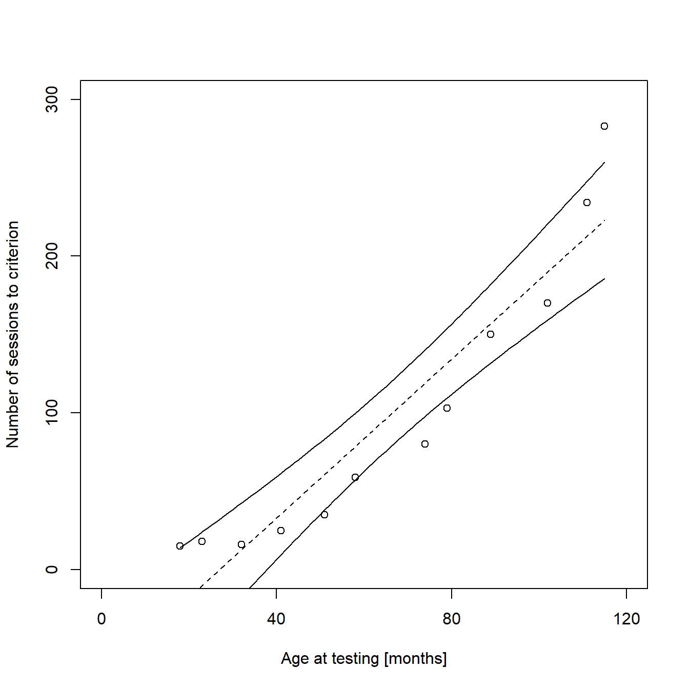
Estimating a Poisson regression model
I stated before that a linear function is not an optimal description of our data. There are several problems regarding our data and the assumptions of a linear model, but also logic errors in the model estimates. Especially the predicted, negative y-values for very young animals are critical from both a logical and a biological perspective. Fortunately, there are several ways to avoid negative predictions. Since our response variable “sessions to criterion” can only take non-negative integer values, a Poisson regression model would be more suited. It models the natural logarithm of the response variable as a linear function of the coefficient (e.g. age), assuming a discrete Poisson distribution and the restriction of predicted values to positive numbers (including 0). Estimating a Poisson regression model in R is very similar to estimating a linear model. The main differences are that we use the glm() function instead of the lm() function and that we have to specify the error distribution and link function to be used in the model:
model2 <- glm(dataBothMethods$sessionsToCrit ~ dataBothMethods$ageAtTest, family = "poisson")
summary(model2)
The summary of the Poisson regression model is:
##
## Call:
## glm(formula = dataBothMethods$sessionsToCrit ~ dataBothMethods$ageAtTest,
##     family = "poisson")
##
## Deviance Residuals:
##      Min        1Q    Median        3Q       Max
## -1.47953  -0.85786  -0.01473   0.45492   2.00126
##
## Coefficients:
##                           Estimate Std. Error z value Pr(>|z|)
## (Intercept)               2.154468   0.111853   19.26   <2e-16 ***
## dataBothMethods$ageAtTest 0.030204   0.001159   26.05   <2e-16 ***
## ---
## Signif. codes:  0 '***' 0.001 '**' 0.01 '*' 0.05 '.' 0.1 ' ' 1
##
## (Dispersion parameter for poisson family taken to be 1)
##
##     Null deviance: 900.634  on 11  degrees of freedom
## Residual deviance:  12.733  on 10  degrees of freedom
## AIC: 88.326
##
## Number of Fisher Scoring iterations: 4
The calculation and plotting of the regression line is also very similar to the method we used before:
plot(dataBothMethods$sessionsToCrit ~ dataBothMethods$ageAtTest,
  ylim = c(0,300),                                      # Limits of the Y-axis
  xlim = c(0,120),                                      # Limits of the X-axis
  ylab = "Number of sessions to criterion",             # Text label of the Y-axis
  xlab = "Age at testing [months]",                     # Text label of the X-axis
  yaxt = "n",                                           # Removes original  Y-axis
  xaxt = "n")                                           # Removes original  X-axis

  axis(side = 2,                                        # Custom Y-axis
  at = c(0, 100, 200, 300),                             # Position of ticks
  labels = c("0","100","200","300"))                    # Tick labels

  axis(side = 1,                                        # Custom X-axis
  at = c(0, 40, 80, 120),                               # Position of ticks
  labels = c("0","40","80", "120"))                     # Tick labels


# Generates a sequence of values from the lowest to the highest original x-value
xNew <- seq(min(x),                                     # from lowest original x-value
            max(x),                                     # to highest original x-value
            by = 1)                                     # increment = 1

# Generates a new data frame with the new sequence of x-values as column "x"
new2 <- data.frame(x = xNew)                            # Column name has to be the same as the name of the "Age in months" vector

# Predicts the belonging log-transformed y-values
preds2 <- predict(glm(y ~ x, family = "poisson"),       # Model formula, identical to model2 from above
                  new2)                                 # Predictions are made for each x-value from the data frame "new2"

# Adds the exponential regression line
lines(new2$x, exp(preds2), lty = "dashed")              # Exponential regression line as dashed line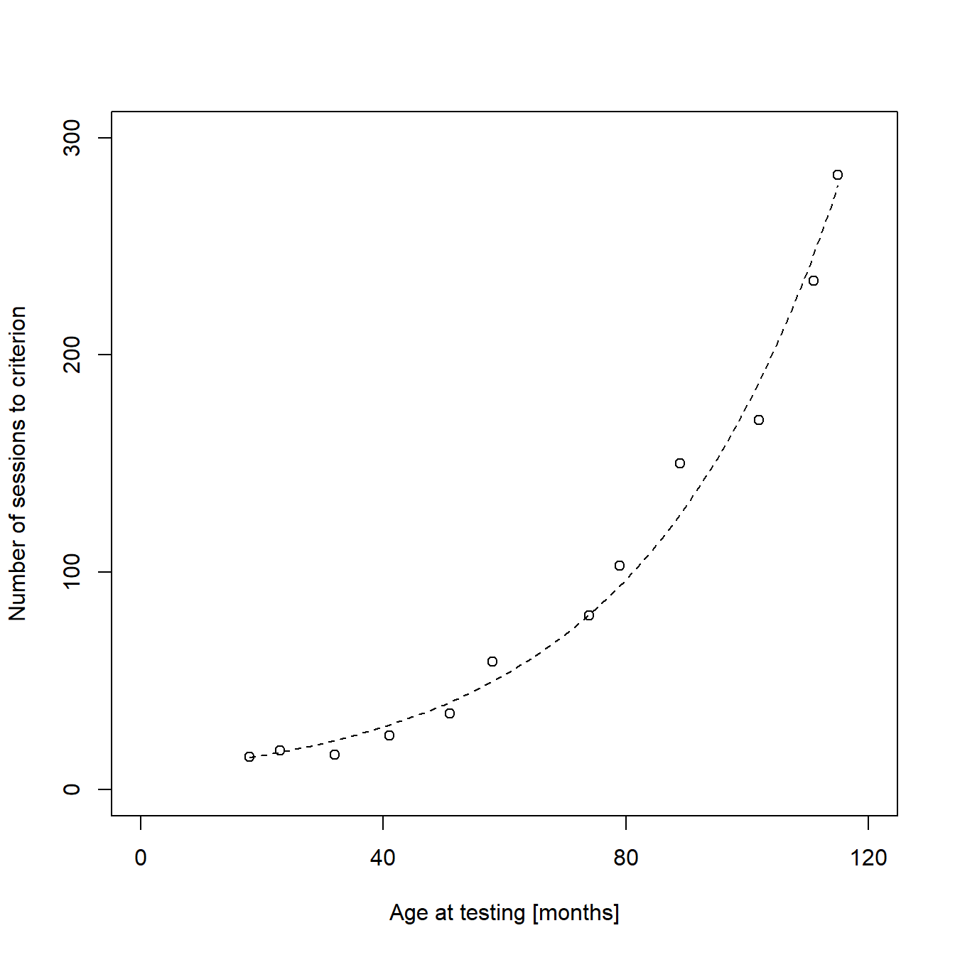
Indeed, the new model seems like a much better fit to our data.
Adding group information to the plot
The final step of the generation of figure 1e is adding information about the training method. In my original publication, two variants of a certain cognitive test were used to train the animals. I decided to add this information to the plot using hollow circles for animals trained in variant 1 and filled circles for animals trained in variant 2. For this, I created a new data frame containing only data from animals that were trained in protocol variant 2 and plotted this data as filled circles on top of the original plot:
################################
# Code for the original figure #
################################


# Extraxts animals trained in protocol variant 2 from the full data set
dataMethodTwo   <- subset(dataBothMethods,                       # Data frame to be devided
                          dataBothMethods$methodID == 2)         # Argument defining which rows to keep

# Adds the reduced data as new layer to the original plot
points(dataMethodTwo$sessionsToCrit ~ dataMethodTwo$ageAtTest,   # Formula
       pch = 16)                                                 # Symbols to be used (16 = filled circles)
Rendering the plot together with the previous sub-figures
As stated in the previous posts, we want our new plot to be one of a total of six plots in a larger figure. We can now combine the new plot with the previous plots to finish the figure and to render it to a single file:
# Setting the output parameters
png("Figure 2 - Performance vs. Age.png",     # File name (saved in the working directory)
  width = 178,                                # Figure width in "units"
  height = 140,                               # Figure height in "units"
  units = "mm",                               # Sets unit to millimeter
  res = 600)                                  # Resolution in dots per inch (dpi)

# Create a matrix of plots
par(mfrow = c(2,3))   # A plot matrix with two rows and three columns

#########################
# Code for sub-figure a #
#########################

#########################
# Code for sub-figure b #
#########################

#########################
# Code for sub-figure c #
#########################

#########################
# Code for sub-figure d #
#########################

#########################
# Code for sub-figure e #

plot(dataBothMethods$sessionsToCrit ~ dataBothMethods$ageAtTest,
     ylim = c(0,300),
     xlim = c(0,120),
     ylab = "Number of sessions to criterion",
     xlab = "Age at testing [months]",
     xaxt = "n",
     yaxt = "n")
points(dataMethodTwo$sessionsToCrit ~ dataMethodTwo$ageAtTest, pch = 16)

axis(side = 1,                                # X-axis
  at = c(0, 40, 80, 120),                     # Position of ticks
  labels = c("0","40","80", "120"))           # Tick labels

axis(side = 2,                                # Y-axis
  at = c(0, 100, 200, 300),                   # Position of ticks
  labels = c("0","100","200","300"))          # Tick labels

x <- dataBothMethods$ageAtTest                # Age in months (x-values)
y <- dataBothMethods$sessionsToCrit           # Sessions to Criterion (y-values)

xNew <- seq(min(x),                           # from lowest original x-value
            max(x),                           # to highest original x-value
            by = 1)                           # increment = 1

new2 <- data.frame(x = xNew)     # Column name has to be the same as the name of the "Age in months" vector
preds2 <- predict(glm(y ~ x, family = "poisson"),
             new2)

lines(new2$x, exp(preds2), lty = "dashed", col = "black")

fig <- par("fig")
x <- grconvertX(c(0, dev.size("in")[1]), from="in", to="user")
x <- x[1] + (x[2] - x[1]) * fig[1:2]
txt <- "e"
x <- x[1] + strwidth(txt, cex=2.6) / 2
mtext("e", side = 3, at=x, line = 2, cex = 1.3)

#########################

#########################
# Code for sub-figure f #
#########################

# Close the specified plot
dev.off()
Outlook
In the next post of this series, I will briefly discuss the code for the remaining plots from my publication. Most of the commands we need to create them have already been covered in the previous posts, but we will combine them in new ways to add more information to individual box and line plots. If you have already mastered the previous methods, feel free to skip the next post of this series and wait for the next but one, in which I will explain how to create animated plots.